Year
2025
Client
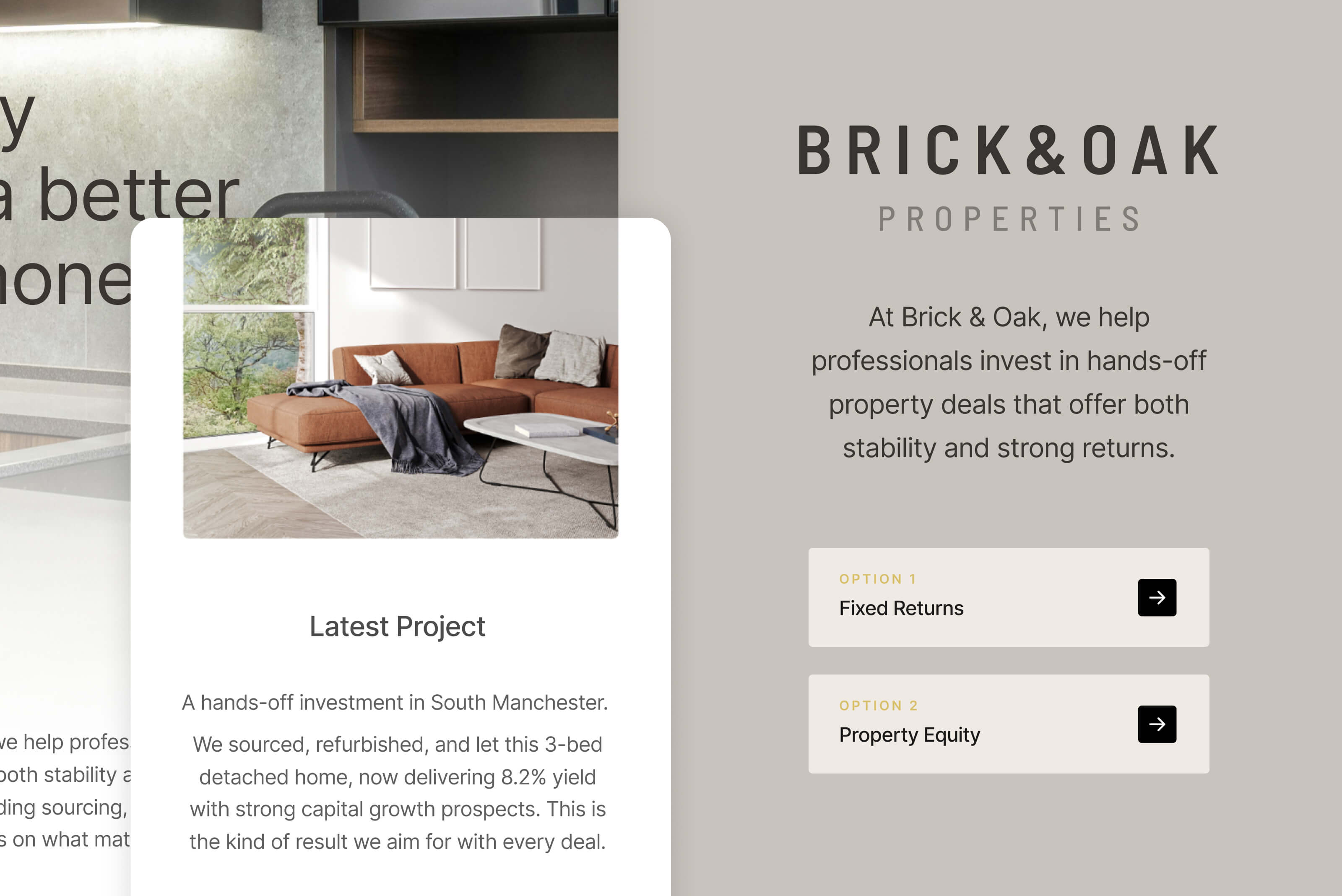
Brick & Oak Properties
Category
Branding, Logo, Website

Project Overview
Brick & Oak Properties needed to build the brand identity of their business which is focused on introducing their hands-off investment model to busy professionals. The aim was to present property as a smart, reliable way to grow wealth without adding to their workload, while presenting themselves as a premium option for helping their clients.
Approach
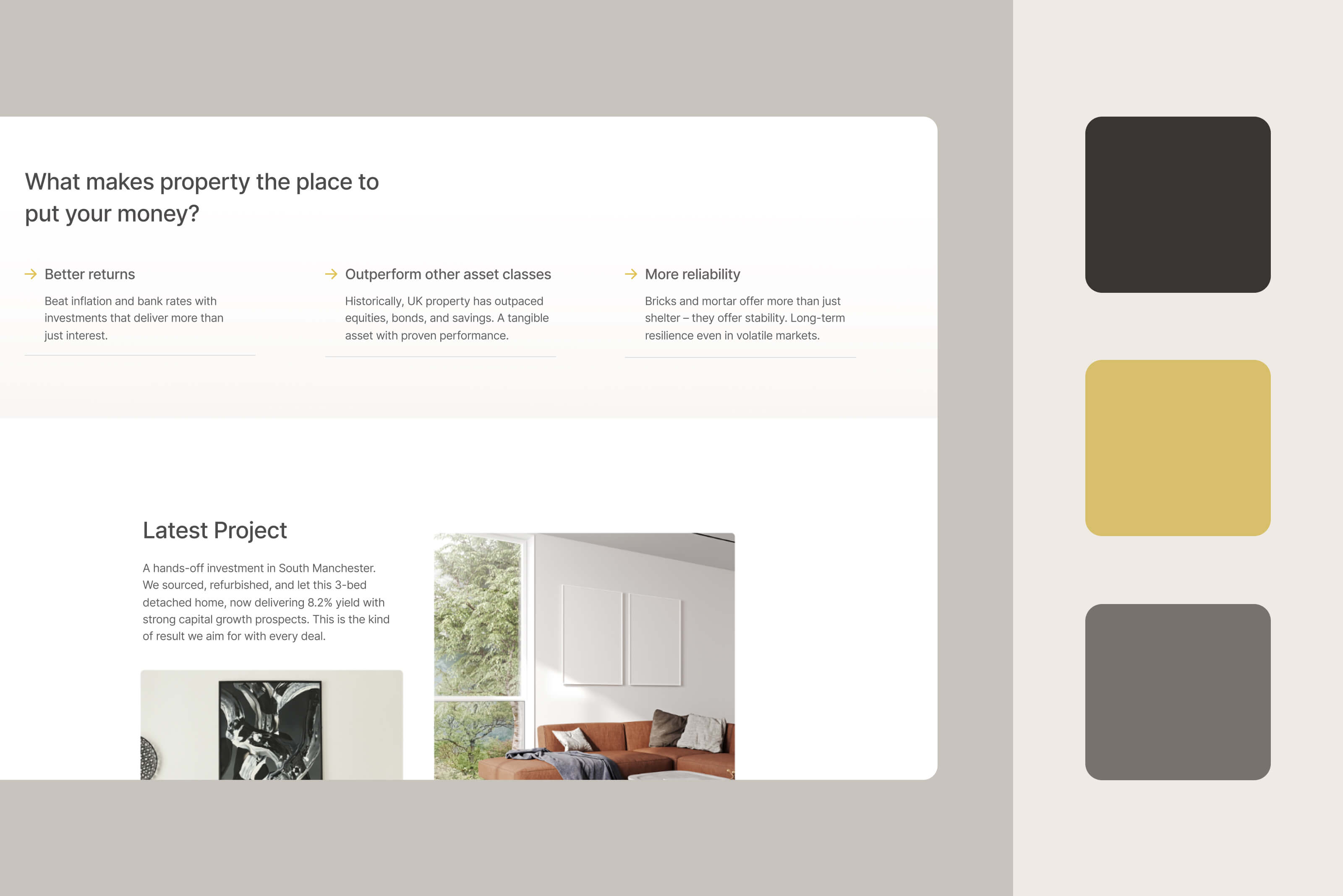
The focus was on what matters most to time-poor investors: simplicity, stability and returns. The home page was structured around two clear options, Fixed Returns and Property Equity, to help users quickly understand what’s on offer and choose the path that suits them.
Design and Content
The goal was to create a premium look and feel that would stand apart from the often dated or generic branding seen across the property sector.
The visual approach was clean and modern, using neutral tones, high-quality imagery and plenty of white space to create a sense of professionalism and calm. Content was kept clear and benefit-focused, designed to build trust and make the investment options easy to understand at a glance.


Conclusion
The final logo and website gave Brick & Oak a strong foundation for attracting investors. By keeping the structure simple and the message focused, we created a clear, trustworthy experience that speaks directly to high-end professionals who want their money to work harder without extra effort.